Original work
These projects were built as personal software ideas and learning projects. They are not generic templates copied into a portfolio just to fill space.
These projects were built as personal software ideas and learning projects. They are not generic templates copied into a portfolio just to fill space.
Each app starts with a very direct use case: check the weather quickly, manage tasks with less friction, or solve a currency-related everyday need.
I treat each release as part of a longer learning process. Feedback, bug reports, and usage patterns help me decide what deserves the next improvement cycle.
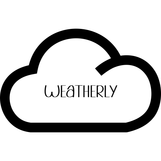
Weatherly is my attempt to keep a weather app simple, readable, and friendly. Many weather interfaces overload the user with panels, ads, and too many competing data points. I wanted a version that feels lighter and more direct.
The project gave me room to practice search flow, visual hierarchy, and the balance between design personality and utility. It also helped me think more carefully about what users need immediately and what information can stay secondary.
.png)
Listly is a small task app built around the idea that simple feedback can help people stay engaged. I wanted it to feel lighter than a full project management tool while still giving the user a sense of momentum and reward.
The most interesting part of this project is not the technical complexity. It is the UX question behind it: how much structure helps users, and when does structure become noise? That question pushed me to keep the interface focused and approachable.
This utility project is built around a very concrete use case: quick conversion and simple change calculations. I like making tools like this because they force me to focus on clarity, speed, and helpful defaults instead of extra decoration.
Practical tools may look smaller than broader apps, but they are useful for improving precision. If a calculator confuses the user, even once, the whole product loses trust. That makes utility projects great training for interface discipline.
Although the categories are different, the projects share the same goal: keep the experience understandable and useful. I prefer apps where the value is visible quickly and the interface supports the task instead of distracting from it.
That is why I document them here in a single portfolio. They show a consistent approach to building, even when the features are very different.
Some projects are more polished than others, and that is normal for an active portfolio. I would rather show real work that is evolving than hide everything until it looks perfect. What matters is that each project is real, functional, and explained honestly.
If you want to help shape future versions, the contact page includes ways to send feedback or join beta testing.